The Artwork Behind Goldbacks
Explore Goldback artwork, symbolism, denomination design, and why visual storytelling matters for collectors and local currency users.
2026-02-04 • 3 min read
Goldback notes are designed as both spendable gold and collectible visual art. Every denomination combines engraved portraiture, layered symbolism, and state-focused themes that help users identify notes quickly while preserving a premium look.
What makes Goldback artwork unique?
Unlike standard fiat paper currency, Goldbacks use a layered aurum process and ornate design language intended to communicate value, identity, and story at a glance. The visual system is not decorative only; it also supports practical recognition during exchange.
Core design goals include:
- Fast denomination recognition
- Strong anti-counterfeit visual complexity
- Regional identity through state-specific themes
- Collectible appeal for long-term holders
Symbolism, virtues, and narrative structure
Most Goldback series are built around personified virtues and historical references. This creates continuity across denominations while giving each note a distinct character.
Common artistic elements include:
- Allegorical figures representing principles like faith, courage, or liberty
- State landmarks and natural geography
- Wildlife and botanical details tied to local ecosystems
- Scriptural or philosophical inscriptions for thematic context
That structure helps collectors connect each denomination to a story, not just a number.
Why visual consistency matters for usability
In day-to-day circulation, clear visual hierarchy improves confidence and reduces confusion. Goldback artwork supports this through consistent framing, typographic placement, and denomination cues.
Practical benefits:
- Easier cashier training and customer verification
- Better distinction between similar-looking notes in low-light conditions
- Higher trust through repeatable design standards
If you are comparing practical use with other bullion formats, see Goldbacks vs Coins vs Bars.
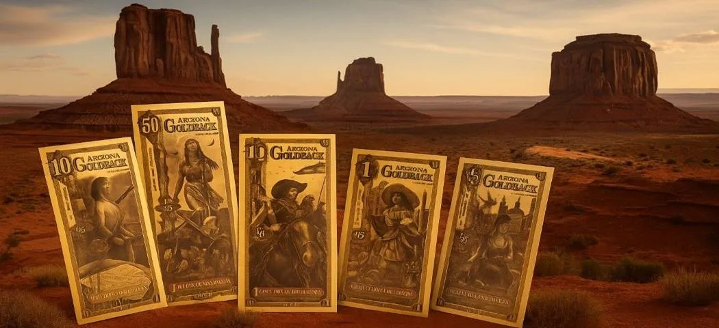
Arizona series art direction
Arizona designs emphasize desert landscapes, frontier history, and regional heritage. Monument-inspired palettes, mission architecture, and historic references reinforce local identity while preserving the broader Goldback visual language.
From lower denominations to larger notes, the artwork often shifts from intimate symbolic scenes to sweeping historic themes, giving each note a different narrative weight.
Related reading:
Goldback artwork and collector demand
For many buyers, design quality is part of why Goldbacks are compelling. Notes that combine technical craftsmanship with meaningful symbolism tend to perform better as keepsakes and gifts, not just transaction tools.
Collector-focused value drivers often include:
- Series continuity and completeness
- Condition quality and handling history
- Edition context and release timing
- Strength of visual storytelling
SEO-focused questions users ask
Are Goldbacks real gold?
Yes. Goldbacks contain measured physical gold in a layered medium. Their artwork sits on top of that utility, making them both functional and collectible.
Why do Goldbacks have so much detail?
Fine detail improves visual recognition, supports anti-counterfeit complexity, and reinforces each series narrative.
Does artwork affect Goldback value?
Artwork does not change the gold content itself, but it can influence collector demand, perceived desirability, and secondary market interest.
Final thought
Goldback artwork is one of the clearest differentiators of the category. It bridges utility and culture: a denomination system meant for practical exchange that still carries rich, place-based storytelling.


